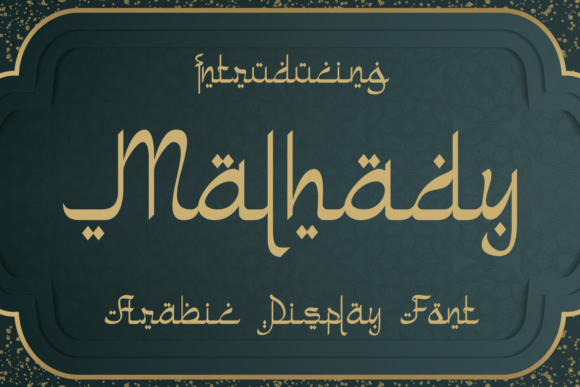
Malhady: A Modern Serif Font for Digital Branding
As a UI designer who ships dozens of landing pages, SaaS dashboards, and e-commerce experiences each year, I pay close attention to how typefaces behave—not just how they look. Malhady stands out because it’s a serif font that bridges editorial gravitas with contemporary digital clarity. It’s not a revival of 18th-century letterforms nor an over-stylized display face. Instead, Malhady delivers clean serifs, balanced proportions, and subtle stroke contrast—making it highly legible at scale while retaining personality in tight spaces.
What makes Malhady especially effective for web design is its intentional rhythm. The x-height is generous without sacrificing elegance; ascenders and descenders are measured, so line-height remains predictable across responsive breakpoints. On mobile, Malhady holds up remarkably well—even at 24px in hero headings or 18px in section titles—without crowding or visual noise. Its optical sizing is tuned for screen use, not print, which means fewer manual adjustments when implementing it across devices.
Where Malhady Earns Its Place in Your Layout
Malhady shines where tone and trust matter most: hero sections, product headlines, brand statements, and conversion-focused CTAs. Because it’s a serif font with modern restraint, it conveys authority without stiffness—ideal for coaching websites, boutique online stores, or premium course sales pages. Try it as your primary display font for H1s and subheadings, then pair it with a neutral sans serif (like Inter or Manrope) for body copy. That pairing creates clear visual hierarchy: Malhady sets the voice, while the sans handles the conversation.
In practice, I’ve used Malhady for:
- A wellness brand’s homepage headline—set large against a soft gradient background—to signal calm confidence
- An independent designer’s portfolio site title and project category labels, reinforcing craft and intentionality
- A digital product’s feature cards, where Malhady in bold weight anchors each benefit before the supporting paragraph
- An online shop’s banner text overlaid on lifestyle imagery—its sturdy serifs maintain contrast even on busy backgrounds
It’s less ideal for long-form body text or micro-interactions like button labels under 14px. Reserve it for short, high-impact phrases: “Start Free Trial,” “Join 5,000+ Designers,” or “Handcrafted in Lisbon.” For buttons, stick to medium or bold weights at 16–18px with generous letter-spacing—this preserves scannability and avoids visual tension.
Readability & Responsiveness: Practical Notes
Malhady performs consistently across light and dark modes. On white or off-white backgrounds, its moderate contrast keeps reading comfortable. Over muted photography or soft gradients, it stays legible without requiring heavy text shadows—just ensure at least 4.5:1 contrast ratio (test with browser dev tools). On dark mode, avoid ultra-thin weights; medium and bold render cleanly against charcoal or deep navy.
For image overlays, use Malhady at 32–48px on desktop, scaling down to 24–28px on mobile. Its open counters and distinct terminals prevent blurring at smaller sizes. Avoid using it below 20px in any context—even with high-resolution displays, fine serifs can soften. If your layout demands smaller headline treatment, consider switching to your sans serif companion instead of forcing Malhady into unsuitable territory.
Pairing, Weights, and Web Implementation
Malhady includes regular, medium, semibold, and bold weights—enough to establish hierarchy without overwhelming your CSS stack. No italic variants are included, so lean on your sans serif for emphasis or pull quotes. That limitation actually helps: it encourages disciplined typography, where contrast comes from weight and scale—not stylistic gimmicks.
File formats include WOFF2 (optimized for web), OTF, and TTF. For websites, serve WOFF2 exclusively—it’s supported in all modern browsers and reduces load time significantly. If you’re building a Figma design system or delivering assets to developers, confirm that variable font support isn’t expected; Malhady is static-weighted, which simplifies implementation and improves rendering consistency.
Multilingual support covers Latin-based languages (including extended diacritics for French, Spanish, German, and Scandinavian use), making it viable for global-facing SaaS products or bilingual blogs. It doesn’t include Cyrillic or Arabic glyphs—so verify language scope early if your audience spans those scripts.
Licensing for Real Digital Projects
Malhady is a commercial font, and its license clearly covers web embedding, SaaS interfaces, client websites, online stores, digital ads, and downloadable brand kits. You’ll need a separate license for app bundling (iOS/Android) or physical packaging—but for everything web-native, one standard license suffices. Always verify usage rights before adding it to templates you sell on marketplaces like Creative Market or ThemeForest. And yes—you can use it in client work, including custom landing pages and Shopify themes, as long as the end client isn’t redistributing the font files themselves.
Unlike many decorative serif fonts, Malhady doesn’t demand attention—it earns it. It supports your message instead of competing with it. Whether you’re refining a fintech dashboard’s typographic system or launching a new creative agency, Malhady gives you a serif font that feels both timeless and digitally native. It’s not flashy. It’s functional, trustworthy, and quietly distinctive—exactly what strong digital branding needs.